Australian Ethical: bringing its new identity to life
Australian Ethical’s purpose is to invest for a better world. The fund manager had been around since 1986 and were the OG in the Australian ethical investing space. As ethical investing became a growing trend, the business faced a pressing need to stand out from its competitors. So, they turned to design consultancy, Accompany, in search for a fresh image.
In March 2021, Australian Ethical was about to enter the implementation stage of their big rebrand. Accompany had done a wonderful job with the reimagination of the brand, and was ready to hand off the new identity for application. This was when I was brought in to be the business’ first visual designer in their newly-formed brand team.
I cannot take credit for the creation of the visual identity, but I took pride in its successful implementation and have since played a key role in shaping the face of Australian Ethical that is seen today.
Employer
Australian Ethical
Timeframe
2021 - 2023
Contributors
Branding agency: Accompany
Illustrations: Joy Li
Video production: Paper Moose
Responsibilities
Art direction
Visual language development
Brand toolkit
Design system
Website
Stationery and merch
Email design
Social creative
Print design
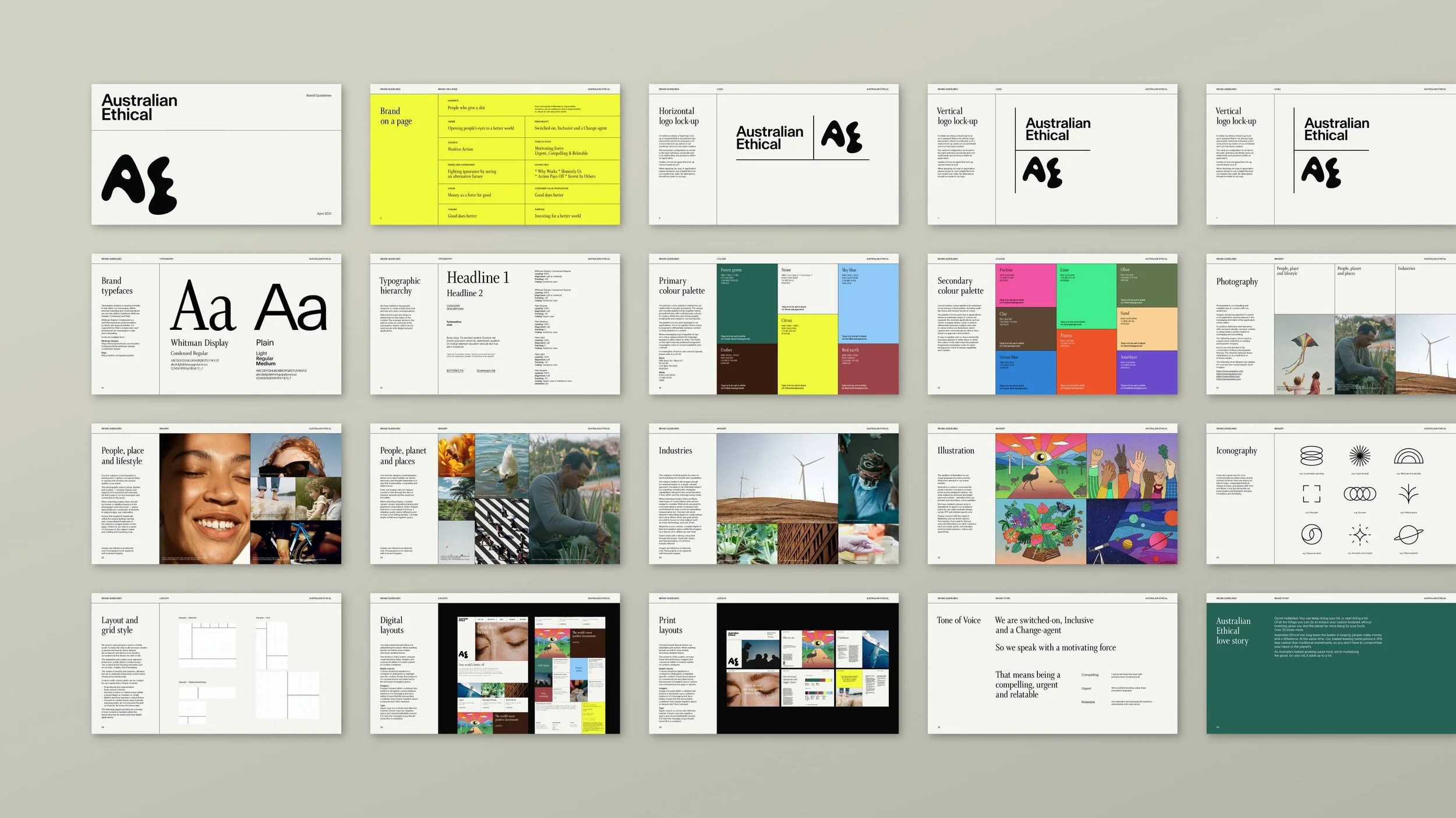
Work by Accompany above – the new brand identity in a 38-page PDF.
Loving the brand from within
As a design practitioner, the brand guidelines in PDF form effectively communicated the brand identity to me. But to the rest of the business, especially to teams outside of brand and marketing, the document was not valued to the same extent.
It was important that all Australian Ethical employees understood the need for the rebrand and what the new identity was and conveyed in order to fall in love with it (if it wasn’t love at first sight already!).
Along with organising an internal brand launch event to showcase the new identity, I designed a brand book which served as a keepsake for existing staff, and is now included as part of the onboarding pack for new employees.
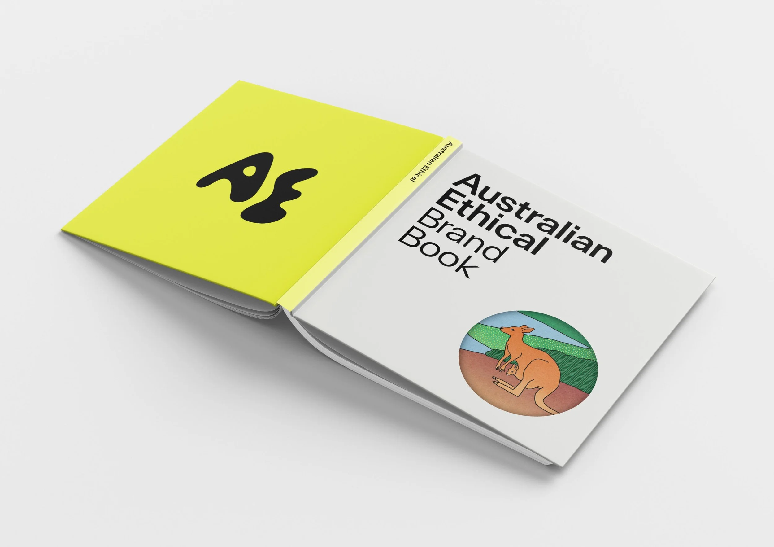
Designed to the dimensions of a CD case, the brand book was easy to carry around. The front cover featured a circle cut out; big enough for an eye to peer through, it symbolised a window to a better world.
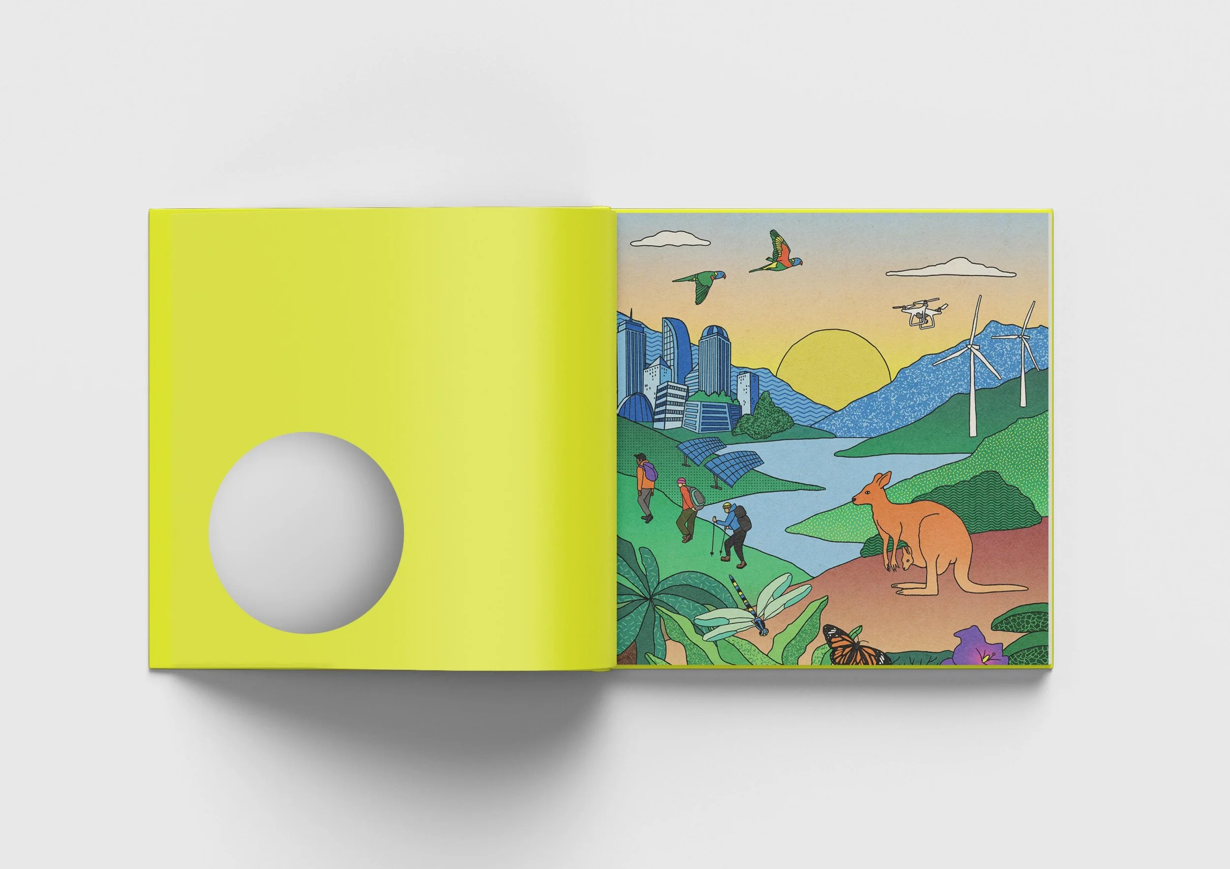
“A better world” – illustrated in the brand style by Joy Li.
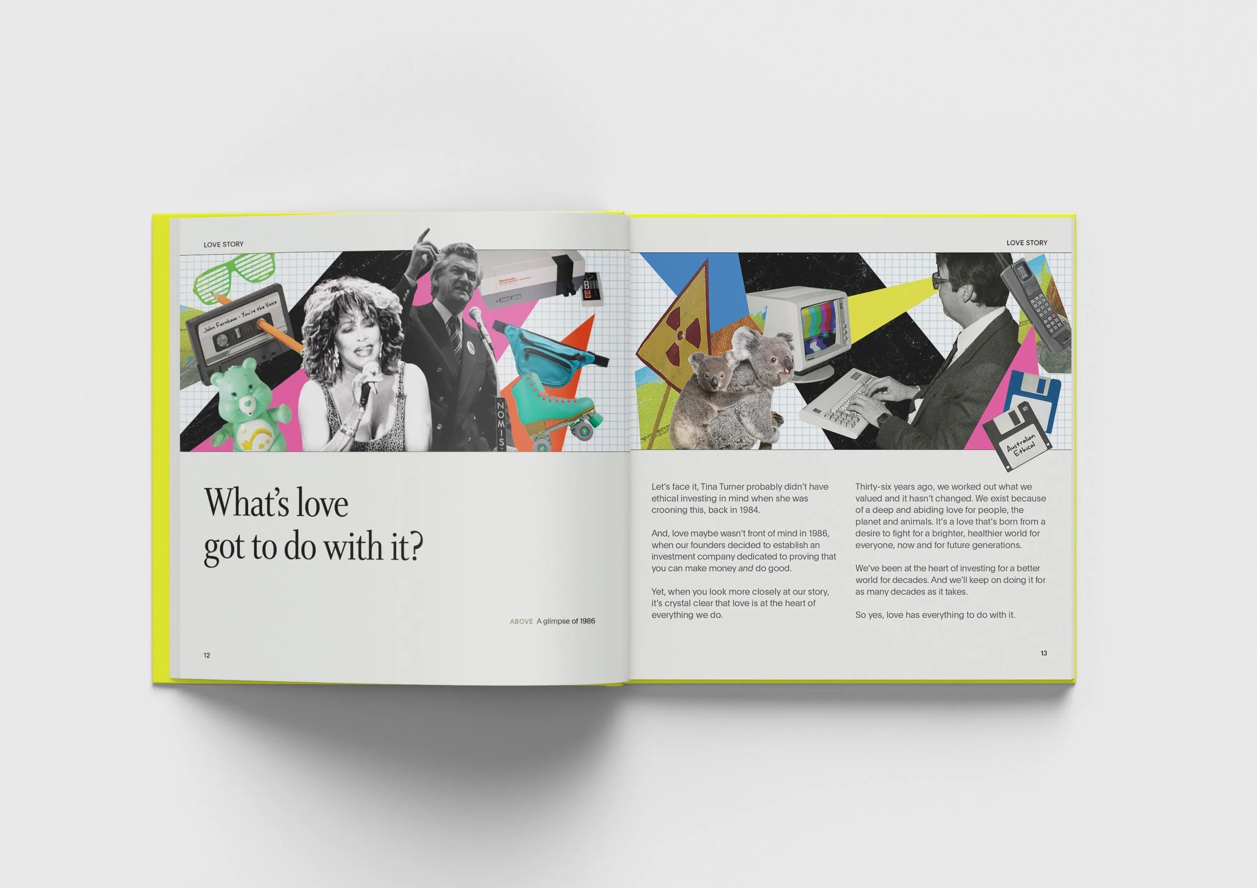
An 80s collage to give a glimpse of the time when the company was founded. The collage style is also brought into our visual language.
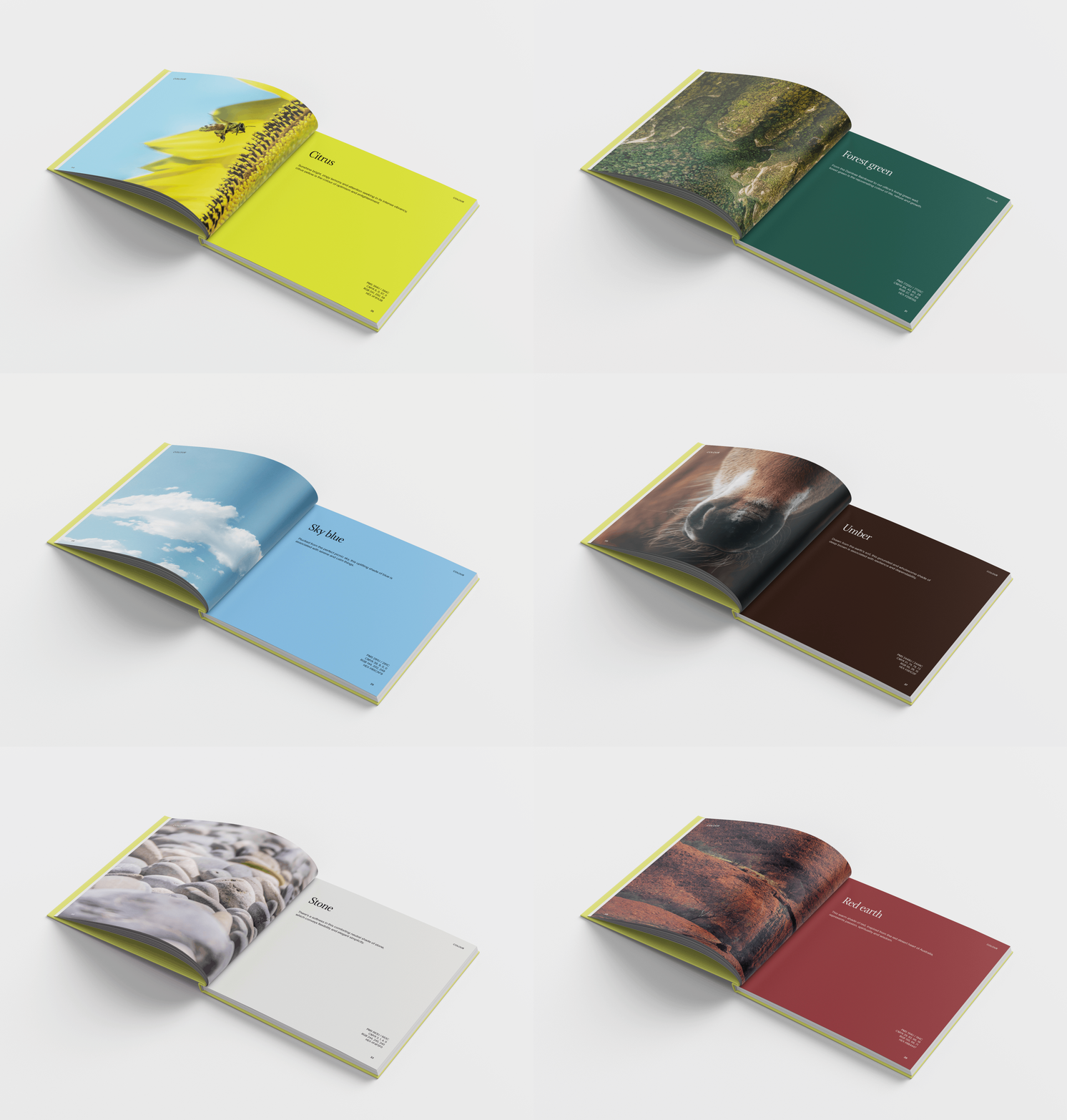
Our colour palette is inspired by nature. Pairing each of the primary brand colours with photography from the natural world reinforces the idea.
Enabling and empowering correct brand usage
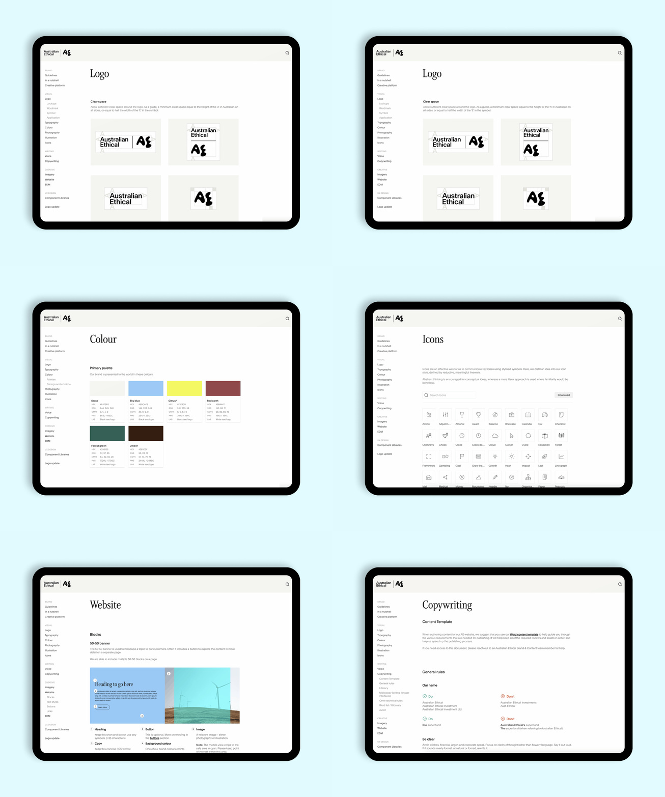
Soon after the rebrand, I upgraded the brand guidelines from a 38-page PDF to a brand toolkit microsite where employees and third-party providers are able to self-serve brand needs such as downloading logo files, colour palettes, icons and brand-approved imagery.
The toolkit also includes guides and documentation for content creators (such as guides for logo usage, copywriting and creating for our web blocks, image specs, recommended colour pairings, and a link to our design system).
Delivering a suite of branded illustrations that is uniquely ours
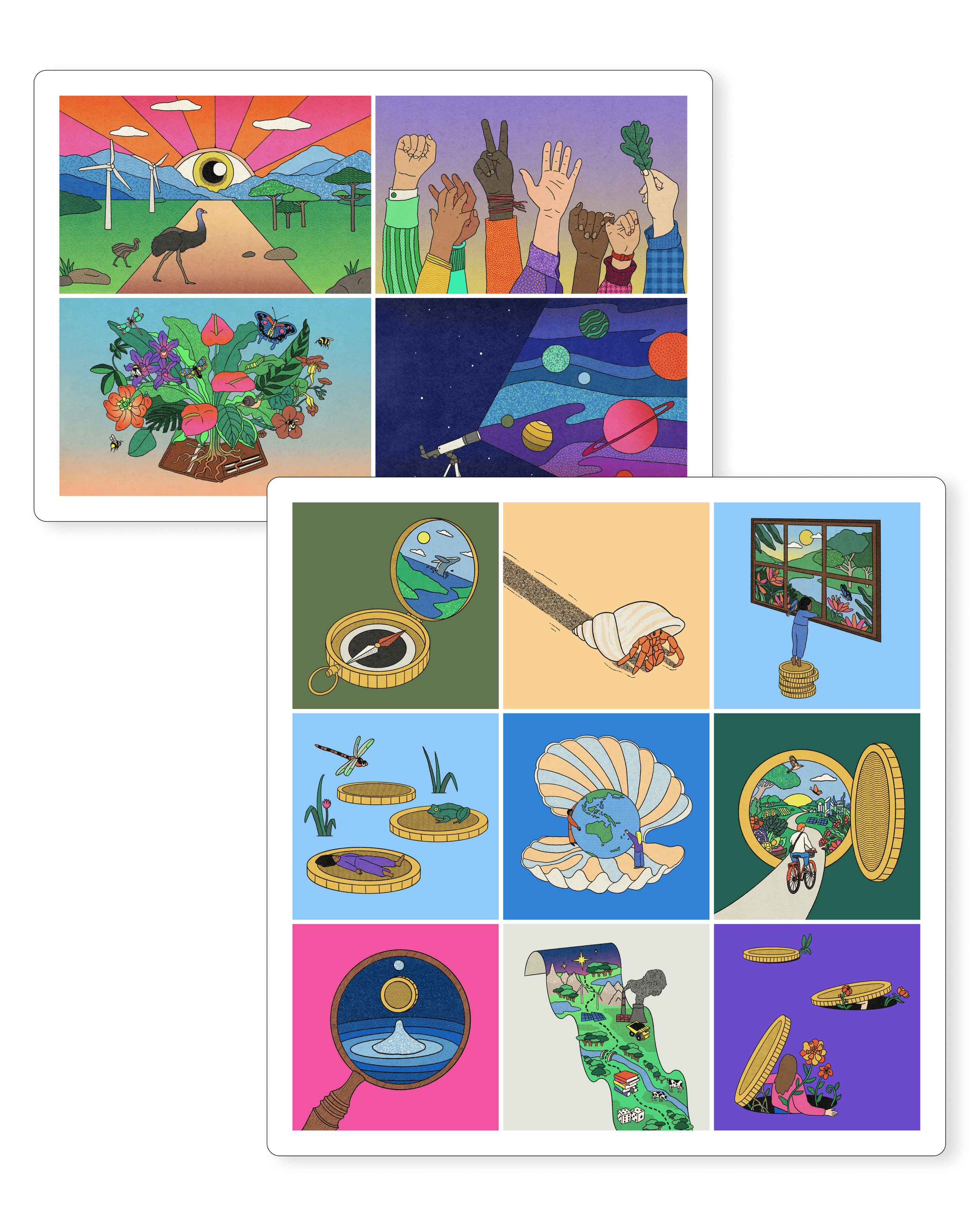
Illustrations provide a distinctive element to our brand identity. It is a means to convey abstract ideas in a metaphorical and clever way.
Working with the talented illustrator, Joy Li, I commissioned a suite of illustrations to tell specific stories related to the business and the products they offer. I came up with the themes and creative concepts, provided references, and collaborated on the iterations until the desired outcome was achieved.
Since the rebrand, I’ve grown the original collection from 4 to 20 illustrations. I had briefed these in as spot illustrations (delivered in layered PSD) in order for the artwork to be easily adapted to different aspect ratios and readily used for a variety of executions.
Bringing the brand to life for the world to see
Translating the brand identity into designs for every single touchpoint was an valuable exercise. Through experimentation, I was able to get a deep understanding of the opportunities and challenges presented by the visual identity. Over time, I expanded the design system, added guardrails, and made a number of improvements to the initial guidelines for better practicality, accessibility and a more encompassing and cohesive design language.
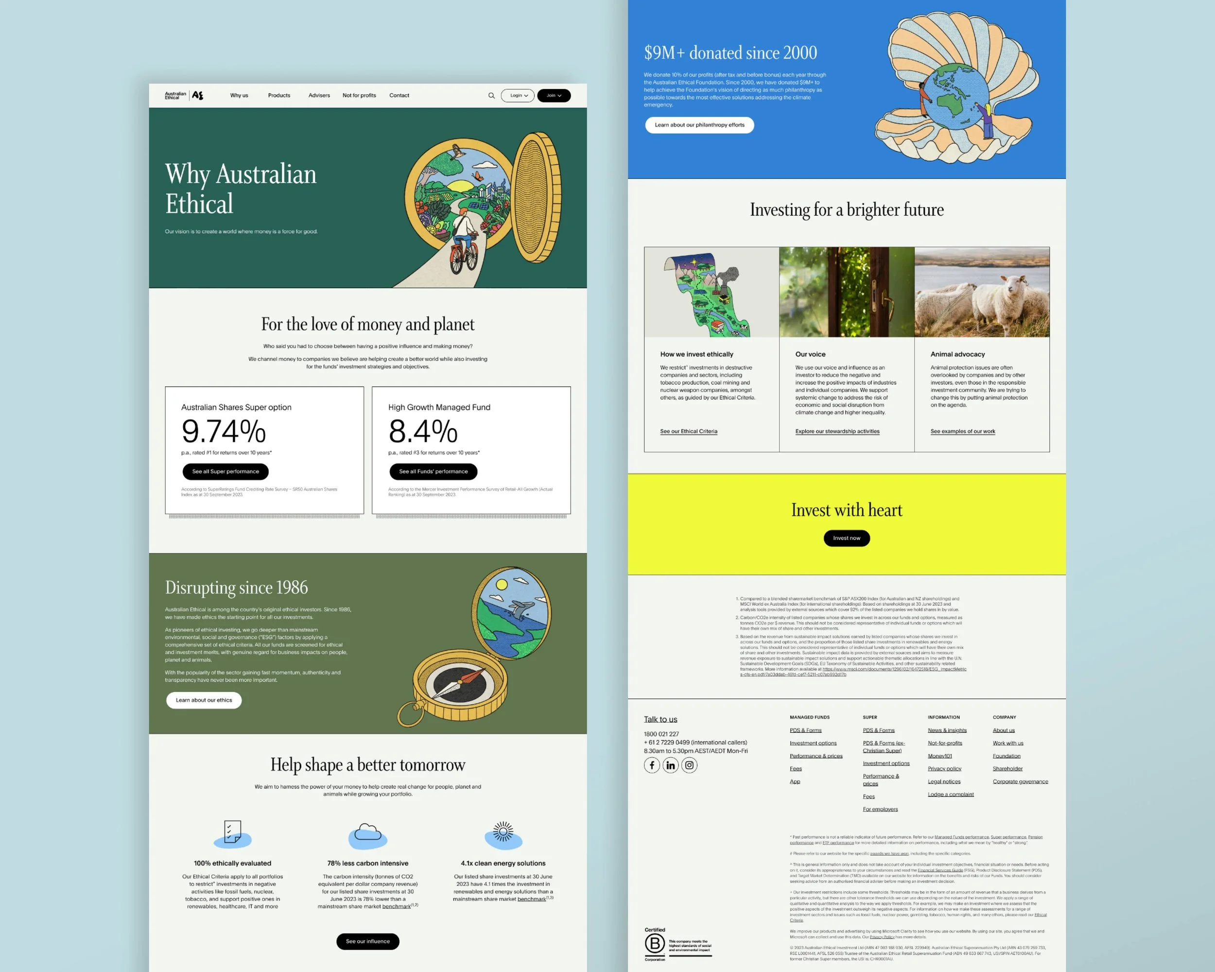
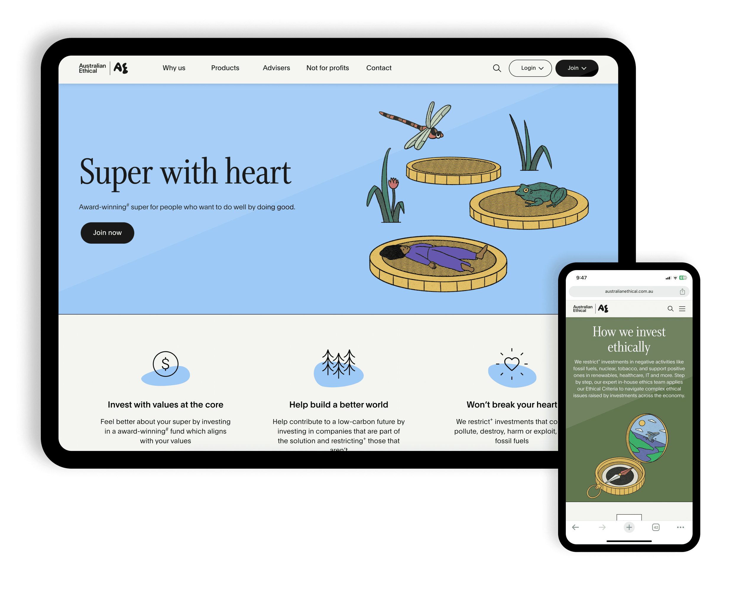
The website was completely redesigned and rebuilt.
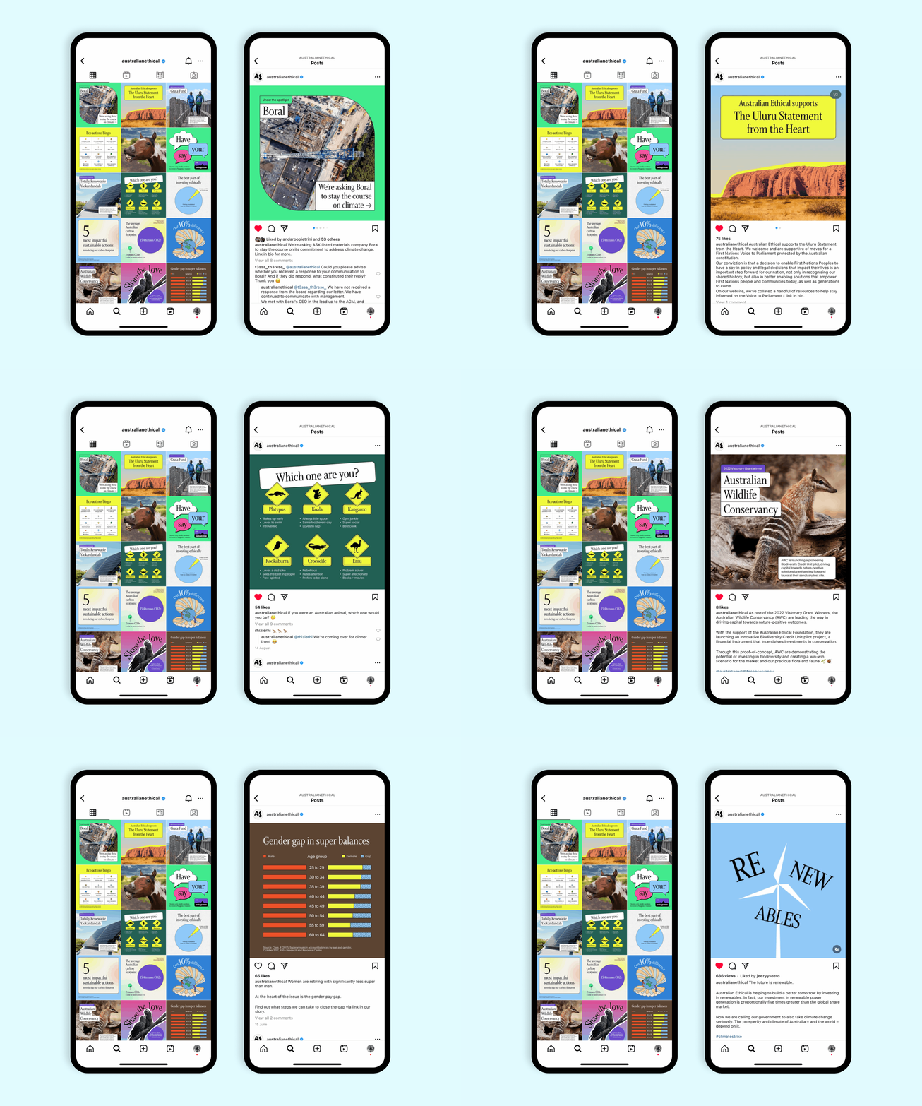
I designed a suite of templates for our social channels to suit to various types of content.
Explainer video – I worked with creative agency, Paper Moose, to establish the style for animated videos.
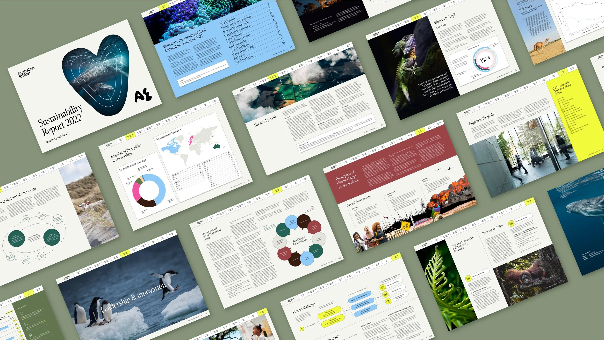
Sustainability Report – I designed the annual report which set the format and style for future reports.
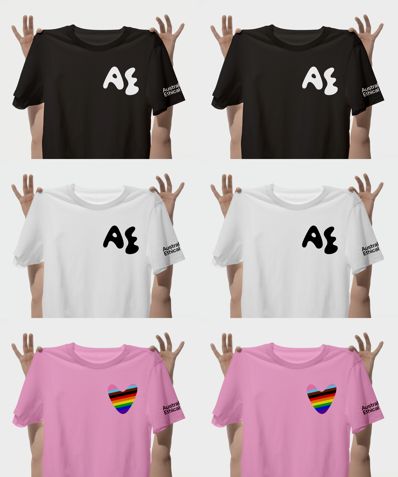
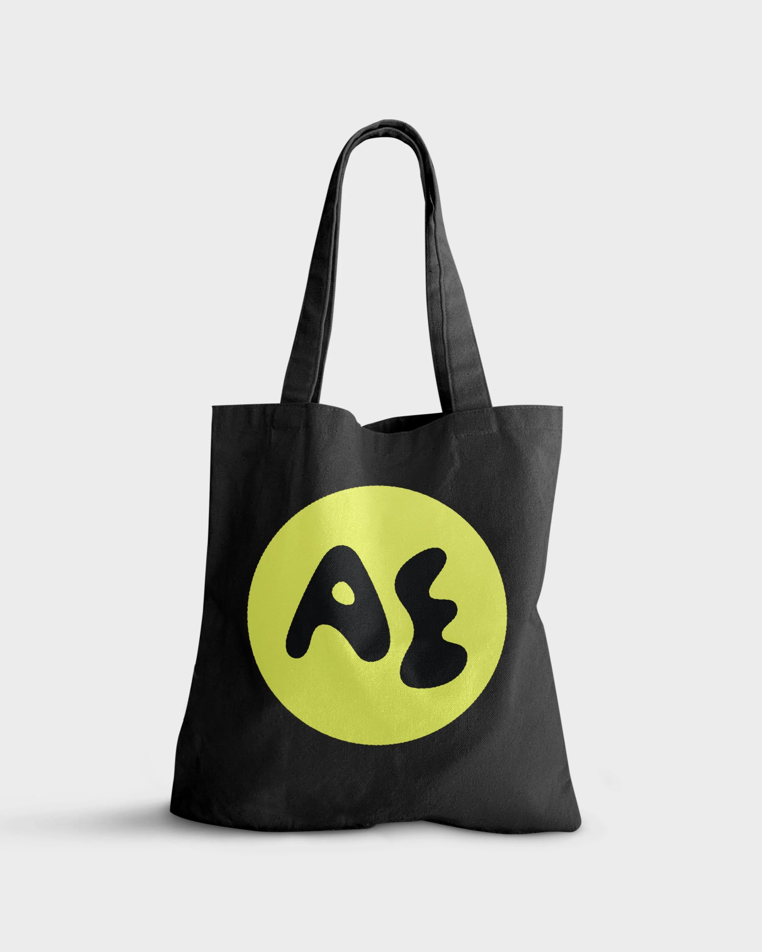
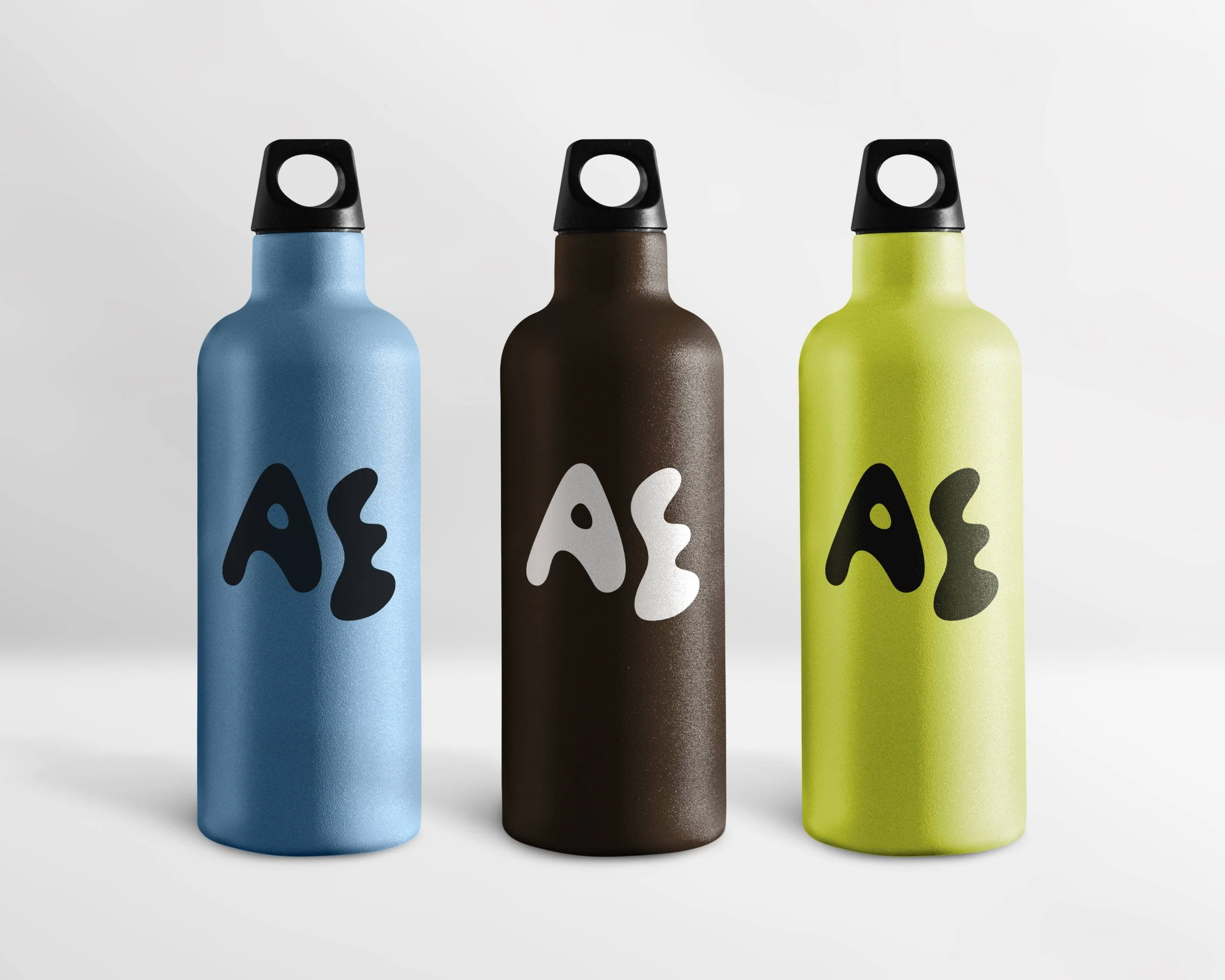
And of course, there is company swag
I designed these for the employee onboarding kit and for giveaways at events.