Good Organic Gardening
The movement to become more sustainable had sparked a surge of interest in gardening. This prompted an opportunity to refresh the much-loved but dated-looking magazine title. With a new and younger audience in mind, I led the art direction and redesign of Good Organic Gardening in 2017.
Reader insights showed a significant portion of the audience were families with young children who were encouraged to take part in gardening projects. Taking this into consideration, the new design included almost tactile elements such as patches of soil, taped pieces of paper, illustrations and handwritten typography, paired with a bright colours used for highlights. The refreshed look and feel was modern and inviting, designed to engage readers and much in the spirit of getting one’s hands dirty, literally.
EMPLOYER: Universal Media Co, 2017
ROLE: Magazine redesign & art direction
*Did not design “Before” issues shown
Covers
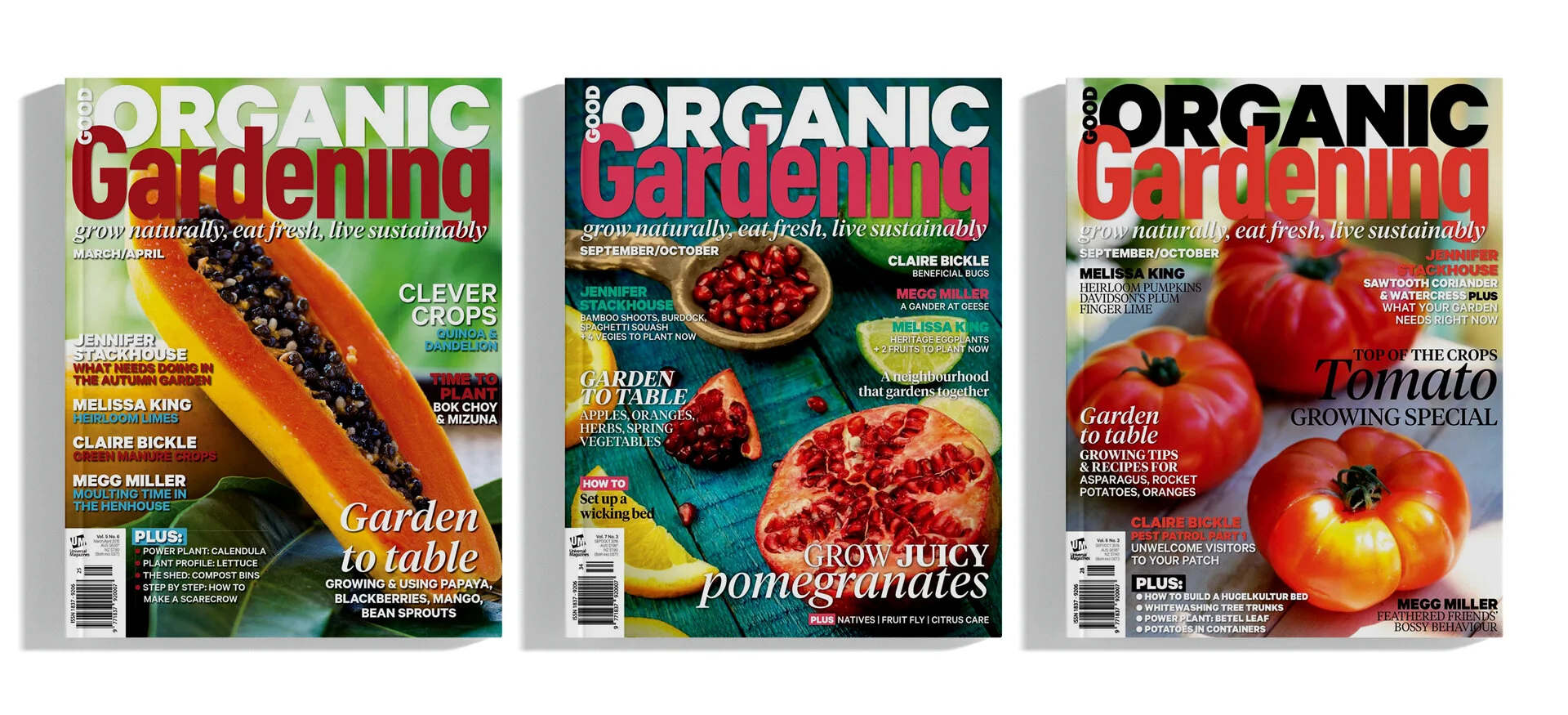
Before: The covers looked busy, calling out up to 12 article headings, with text going over detailed sections of the background images. The use of colour in text also adds to the visual cacophony, while the serif typeface in italic and heavy drop shadows contribute to the dated look and feel.
After: A smaller edit of stories is being featured on the covers, while the images chosen for backgrounds allow for copy space without the need for heavy drop shadows for the headings to be legible. Stripping back to only using coloured text for writer names or the featured story title, and updating the typefaces used in the magazine overall, the covers look more current and cohesive.
Contents
Before: The table of contents listed all content pieces in sequential page order, without any grouping.
After: Content pieces are grouped into sections for readers’ ease of navigating the magazine.
Things to do
Before: The information was presented in running text, grouped under the topics - Vegetables, Fruit and Compost & Soil. Climate-specific advice was provided for each topic.
After: The information is split up into climate-specific advice from the get go so readers can clearly pick out the relevant section to them. Each column covers one topic, with accompanied illustrations for quick reference.
This is a new section added to the redesign. On the left is a guide to planting based on the phases of the moon. Illustrations are used in the calendar for quick reference. On the right is a breakdown of what to plant based on climate zone, with map shading for a visual guide.
Plant profile
Before: Running text throughout the article, with only one breakout section.
After: A label is introduced for readers to see at a glance whether the featured plant would be a suitable choice for them, while the stamp above the heading indicates where the plant should live. Pull-out text and an additional breakout box is included as part of the style to make the content more easily digestible.
Gardening Folk
Before: The contributors’ piece used traditional-looking typography. The photography provided often varied, and image captions relied on heavy drop shadows for legibility.
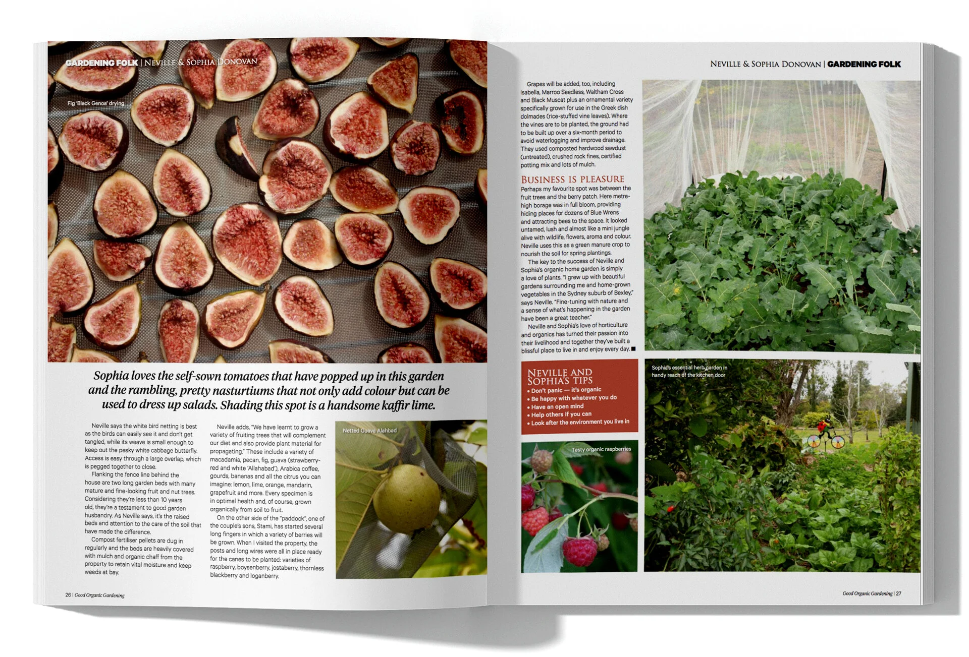
After: It is considerably easier for contributors to submit a headshot/selfie rather than a photo of themselves working in the garden. The new layout allows for the gardening folk to be pictured in a smaller frame, so the garden could be the focus in the opener. Images are displayed in a collage style, numbered for caption reference.
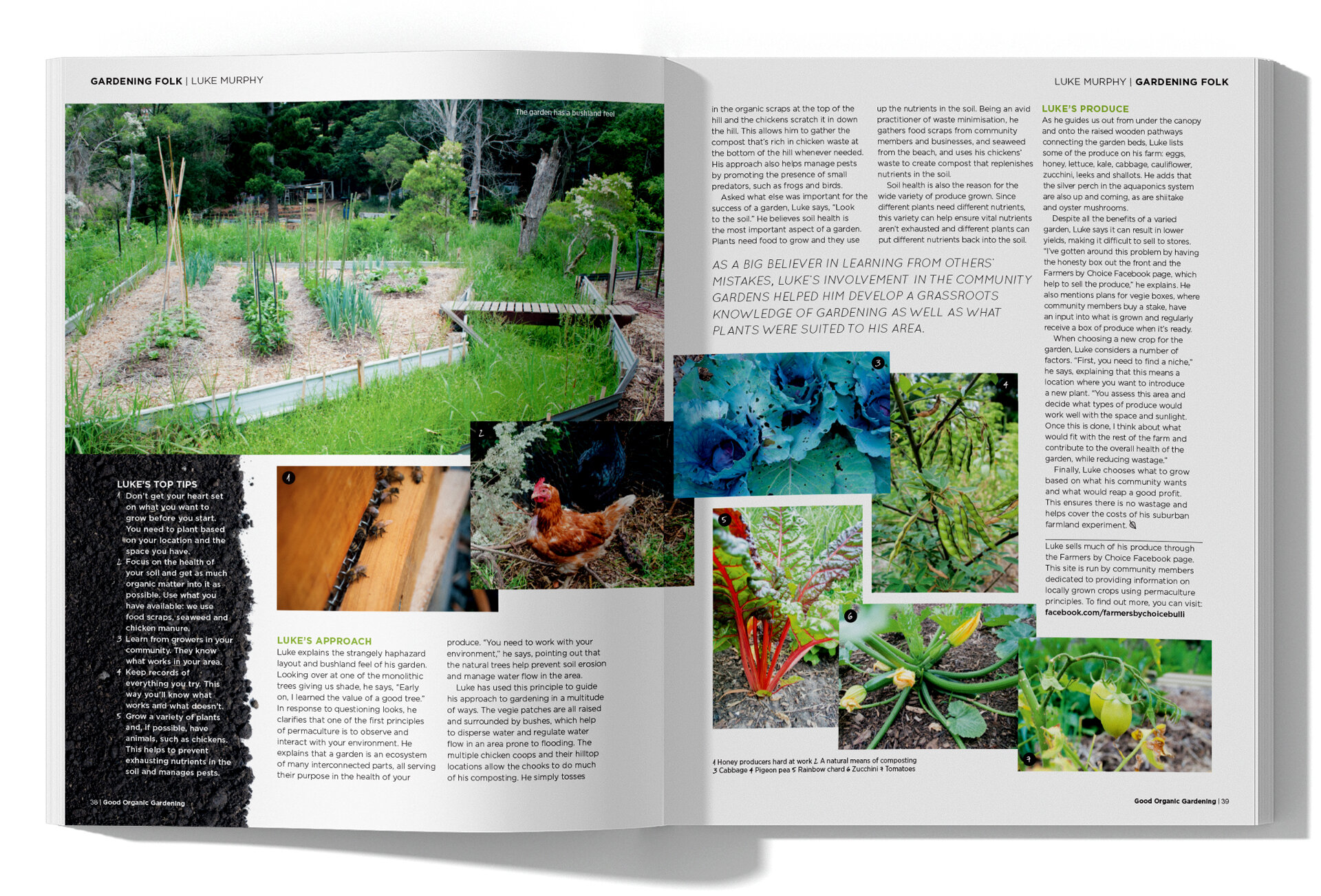
After: The “top tips” breakout section has been revamped to go on a soil background. The sprawling images also provide for a more interesting layout.